freee.co.jp Brand Top Page UI/UX Redesign
Improving Bounce Rate Through User-Segment-Based Information Architecture
−16%
Bounce Rate
vs. original design
+123%
Average PV per Session
vs. original design
Primary KPI
Bounce Rate Improvement
Client
freee K.K.
Page
Brand Top Page
Initiative Type
UX Design / Page Redesign
Approach
GA4 / UserInsight
Background
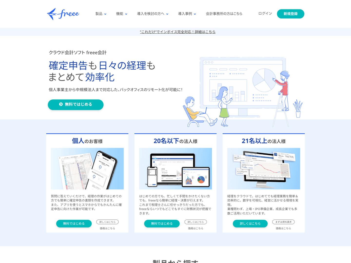
"A page for everyone" ends up being for no one
The freee.co.jp brand top page was functioning as the entry point to freee's range of products. In practice, however, it had become a page that simply listed products — with an unclear purpose and an ambiguous user experience.
freee's product lineup divides broadly into products for businesses and products for individuals, with users from each segment bringing entirely different needs and contexts. Despite this, the content was presented in a single undifferentiated layout — making it difficult for users on either side to find "information relevant to them."
Problem Analysis
Reading "where each user is getting lost" with GA4 and heatmaps
I combined GA4 user attribute analysis, traffic source analysis, and exit page data with UserInsight scroll depth and click maps to diagnose the current state.
Two problems emerged from the analysis. First, scroll depth was shallow — most users were leaving from the top of the page. Second, despite a large number of products listed, clicks were concentrated on specific products near the top, with no effective pathways guiding users to other products.
GA4's device-segmented data also confirmed differences in user profile tendencies between desktop and mobile traffic — providing the evidence needed to optimize content display order by device.
Key findings from GA4 + UserInsight
Mass drop-off near the top; clicks concentrated only on specific products at the top. Conclusion: content needs to be organized by business/individual user type, with navigation designed to guide each segment naturally to the products they need.
Problems
Four problems identified before the redesign
Problem 01
The page's purpose was unclear, and neither business nor individual users were finding "information meant for them."
Problem 02
Clicks were concentrated on specific products near the top, with no effective pathways to other products.
Problem 03
The first view lacked a UI/UX that appropriately guided users based on their profile and intent.
Problem 04
Differences in user profiles by device were not accounted for — the same content order was shown on all devices.
Solution
Redesigning the structure around "who this page is for"
The core principle of the redesign was to clearly separate sections for business and individual users — restructuring the page so that 'information relevant to me' is immediately findable.
Fix 01 — Section Separation
Clearly separated business and individual content, restructuring the page so the relevant section is immediately recognizable.
Fix 02 — Navigation Clarity
Created simple pathways to primary products, directing users to a product search page for everything else.
Fix 03 — First View Strengthening
Added anchor links at the top of the page for one-click navigation to business or individual content.
Fix 04 — Device-Specific Optimization
Desktop defaults to business content at the top; mobile defaults to individual content at the top.
The device-specific content order optimization was grounded in GA4 data confirming that the primary user profile differs by device. Desktop traffic skews toward business users evaluating the service at their desk; mobile traffic skews toward sole proprietors and freelancers doing casual research on their phone. These behavioral differences were reflected in content prioritization.
Desktop — Business content first
For business users evaluating options at their desk, business product pathways are placed at the top of the page.
Mobile — Individual content first
For sole proprietors and freelancers doing casual research on their phone, individual products are surfaced first.
Process
STEP 01
GA4 Traffic, Exit & Device Analysis
Analyzed user attributes, traffic sources, and device-specific behavioral patterns. Quantified device-based differences between business and individual users.
STEP 02
Behavioral Analysis with UserInsight
Confirmed mass drop-off near the top and click concentration on specific products via scroll depth and click maps. Identified priority areas for improvement.
STEP 03
IA Design & Content Restructuring
Defined section separation for business/individual segments, first-view messaging strategy, and device-specific content order policy.
STEP 04
UI Design & Responsive Layout (Figma)
Produced desktop and mobile designs in Figma, incorporating the device-specific content order changes into each layout.
STEP 05
Implementation & Release
Implemented from design. Released with responsive support and device-specific content order switching included.
STEP 06
Measurement & Reporting
Measured bounce rate, PV count, and per-section CTR. Quantitatively confirmed improvement impact and reported to the team.
Insight
A top page's job is not to "show" — it's to "deliver"
The more products a company has, the more a top page tends to become "a place to put everything." But from the user's perspective, a page where relevant information can't be found quickly becomes a reason to leave — no matter how much content is there.
The fact that clicks were concentrated on specific products near the top should not be read as "users only cared about those." It should be read as: "the design only made those visible."
CRO principle applied
Engagement drops sharply from the second view onward, making the first view the highest-leverage placement. When the primary user profile differs by device, optimizing content display order to match device characteristics drives simultaneous improvement in both bounce rate and page depth.
Results
Simultaneous improvement in bounce rate and page depth
−16%
Bounce Rate
vs. original design
+123%
Average PV per Session
vs. original design
Next Steps
Each of these case studies follows the same end-to-end process: analysis → design → implementation.